Stephan Martiniere

Tor.com Analyses Brasyl Covers

In his series on the Hugo Novel nominees, Pablo Defendini of Tor.com is taking a look at both the US and UK covers for Ian McDonald’s Brasyl.Our cover was designed by Jacqueline Cooke, illustration by Stephan Martiniere. The U.K. Edition Illustration & Design is by Dominic Harman, (another fine artist that we have engaged for our upcoming James Enge title, btw.)

Full analysis and subsequent discussion well-worth checking out, but I’m particularly gratified that Pablo got what the overlays of the title were meant to represent:

“The neon/florescent color scheme for both the painting and the type certainly communicates a sense of electric vibration, which ties in nicely with the concept of quantum computing (and certainly reminds us of Terry Gilliam’s film by the same name). Perhaps florescent or otherwise special inks were used in printing—the final effect is blindingly intense. Overlaying three instances of the title, off-register with each other and in three different neon colors adds to this vibration. It also complements the bustle depicted in the street scene nicely. Additionally, the three instances of the title relate conceptually to the three-story structure of the novel. While the choice of typefaces is somewhat orthodox, and could be perceived as boring under other circumstances, I think it works in this case: anything more complicated or ornate for the title would have rendered it much harder to read, when coupled with the three-instance treatment; and the simplicity and directness of the sans-serif typeface used for the author’s name serves as a nice contrast to the busy, hectic feel of the title proper. It also adds a solid, light-valued area to the top of the composition, which helps balance out the lightest areas of the illustration towards the bottom, and tie the composition together a little better.”

Tor.com Analyses Brasyl Covers Read More »

Lou on the Web

Lots of Lou on the Web!

SFSignal is back with another Mind Meld. This one looks at Hollywood Science Fiction and asks “What other story, or stories, do you believe are deserving of being made into movies and why?” In addition to Yours Truly, responses are from Peggy Kolm, Michael L. Wentz, Michael Blackmore, SciFiChick, and the always interesting John C. Wright. Wright argues that, as a visual medium, “A science fiction movie that does not involve spectacle and special effects is not taking advantage of the primary strength of movies.” I concur. I’d pick my list from some newer works though, as nothing dates like the future. Still, as I say in my own piece, with the cost of CGI dropping, there’s going to be more of everything, so I think they’ll be enough to keep us all happy.

Meanwhile, I’m interviewed about illustrator Stephan Martiniere over on io9.com in “The Future Will Be Bio-Mechanical.” Some very nice samples of his work, including the concept art he did for the I, Robot film that happens to be the piece that lead me to put him on our edition of River of Gods.(And speaking about Ian McDonald books, although I’m not in it, there is an interview with Ian talking about both Brasyland the forthcoming The Dervish House up at Post-Weird Thoughts.)

Finally, GalleyCat uses the occasion of Michael Moorcock’s Grand Masterhood to quote me and others talking about John Picacio’s genius in a piece titled “A Grand Master’s Greatest Character Reborn.” This is, of course, about Picacio’s recent work conceiving and illustrating Moorcock’s Elric: The Stealer of Soulsreissue for Del Rey as well as our own The Metatemporal Detective.Michael Whelan’s Elric has always been the definitive portrayal of the character for me. Until now. Go see why.

Lou on the Web Read More »

City Without End takes Silver Spectrum Award

A huge congratulations to Stephan Martiniere, whose cover illustration for the third book in Kay Kenyon’s ongoing space opera quartet entitled The Entire and the Rose, the forthcoming City Without End, just won the Silver Spectrum award in the book category. All of Stephan’s covers in this series have been amazing. Book one, Bright of the Sky,made the Spectrum annual the year it was released, and we’re hearing good things about A World Too Near– which just hit shelves this week. (For a look at these two covers side by side, see Kay’s website.) And now, unveiled here for the first time, the winning cover of City Without End. This is my favorite of the three “Entire” pieces, and maybe one of my favorite Martiniere illustrations ever.

What do you think?

Meanwhile, long as we’re talking about The Entire and the Rose, I’ve just spotted some very thoughtful, articulate (and spoiler ridden) reviews of Bright of the Sky and A World Too Near up at SF Reviews. Of book one, they say, “If what you crave in your SF is a fresh and dynamic approach to world-building, wed to epic storytelling with believably flawed heroes and vividly imagined alien cultures, and you’re frustrated that nobody seems to be bloody doing it, odds are you’ve been skipping over the Kay Kenyon novels every time you go to the bookstore.” Meanwhile, looking at book two, they say, “…it must be said that at the end of the day, this series, exciting as it’s turning out to be, is in many ways pure fantasy formula — just tricked out in the most gorgeous production values imaginable. But who cares if it’s formula as long as the entertainment value is blowing your doors, right? A World Too Near is sweet, splendid entertainment. Kay Kenyon will have you solidly hooked with this series, and if you’ve never had her name down on your reading list before now, it’s way past time you added it.”

City Without End takes Silver Spectrum Award Read More »

Hugo and Chesley Awards

I am back from Japan and the Hugo Awards, where it was a great honor to accept the award for Ian McDonald. Ian won Best Novelette for “The Djinn’s Wife“, originally published in Asimov‘s July 2006 issue. “The Djinn’s Wife” is, of course, part of the future India milieu Ian created in his Hugo-nominated novel River of Gods.Pictured left is co-host George Takei, Yours Truly, and Ian’s beautiful Hugo, which featured a statue of long-running Japanese SF hero Ultraman.

Meanwhile, the evening before, I was equally honored to accept a Chesley Award on behalf of Stephan Martiniere in the category of Best Cover Illustration – Hardcover for the wonderful work he did for the cover of River of Gods.

My full convention report is here. Also, be sure to see Jay Lake’s LiveJournal for some more great pictures from the show.

Hugo and Chesley Awards Read More »

22nd Annual Chesley Awards Final Ballot

The Association of Science Fiction & Fantasy Artists has just released their list of the 22nd Annual Chesley Awards Nominees. ASFA members can download the Final Ballot here, and vote by August 10th.

Obviously, I’m thrilled that Stephan Martiniere’s wonderful illustration for the Pyr edition of Ian McDonald’s River of Godstops the list of the “Best Cover Illustration — Hardback Book.” Stephan is nominated again in the category of Award for Artistic Achievement.

Meanwhile, my dear friend and illustrator for all five of my own anthologies, John Picacio, is also up twice, for the amazing work he did on the cover of the Eos reissue of A Canticle for Leibowitzand for the cover of Interzone magazine’s 204th issue.

But beyond all that, I’m deeply honored to have shown up on the shortlist myself for Best Art Director. I don’t know if this is the first time someone from editorial has made the shortlist, but it’s got to be a rare occurrence if not a unique one. So I want to say upfront that while I’m very pleased and proud, what this nomination means is that people think our books look really damn good, and that is a credit to a great many people. Beyond the fabulous illustrators we’ve had the privilege to work with — Picacio, Martiniere, Caniglia, Brian W. Dow, Greg Bridges, Bob Eggleton, Jim Burns, Dave Seeley, among others — my parent company Prometheus Books has a fabulous art department, and one that is very patient to put up with me breathing over their shoulders to the degree that I do. Jaqueline Cooke, Grace M. Conti-Zilsberger, and Nicole Sommer-Lecht are all tremendous, very talented, and I am very grateful to them to work so hard and so well in the service of the Pyr line. What’s more, I owe an eternal debt of gratitude to Irene Gallo and John Picacio, who have both been very free with their time and their advice and are much wiser souls than I.

Now, here’s the full list:

Best Cover Illustration — Hardback Book
* Stephan Martiniere, “River of Gods”, by Ian McDonald, Pyr, Mar 2006
* Jon Foster, “The Demon and the City”, by Liz Williams, Night Shade Books, Aug 2006
* Donato Giancola, “The Thirteenth House”, by Sharon Shinn, Ace, Mar 2006
* Todd Lockwood, “Temeraire: In the Service of the King”, by Naomi Novik, SFBC, 2006
* James A. Owen, “Here, There Be Dragons (Chronicles of the Imaginarium Geographica)” by James A. Owen, Simon & Schuster, Sept 2006

Best Cover Illustration — Paperback Book
* John Picacio, “A Canticle for Leibowitz”, by Walter M. Miller, Eos, May 2006
* Daniel Dos Santos, “Moon Called”, by Patricia Briggs, Ace, Feb 2006
* Vince Natale, “Queen of Attolia”, by Megan Whalen Turner, Eos, Jan 2006

Best Cover Illustration — Magazine
* Steven Gilberts, “Dark Wisdom: the Magazine of Dark Fiction”, Winter 2006
* Renee LeCompte, “Fantasy Magazine”, Summer 2006
* John Picacio, “Interzone” #204, May/June 2006
* r.k.post, “Dragon” #336, January 2006

Best Interior Illustration
* Tony Di Terlizzi, “Care and Feeding of Sprites”, by Holly Black & Tony Di Terlizzi
* Omar Rayyan, “Cricket Magazine”
* Yvonne Gilbert, “The Ice Dragon”, by George R.R. Martin, Starscape, Oct 2006
* Justin Sweet, “Kull: Exile of Atlantis” by Robert E. Howard, Del Rey, Oct 2006
* Ruth Thompson & Lawrence Allen Williams, “The Book Angels” by Todd Jordan, Sterling 2006
* Michael Kaluta, “The Orphan’s Tales: In the Night Garden” by Catherynne M. Valente, Spectra, Oct 2006
* James A. Owen, “Here, There Be Dragons (Chronicles of the Imaginarium Geographica)”, by James A. Owen, Simon & Schuster, Sept 2006

Best Color Work — Unpublished
* Jim Burns, “Dryad of the Oak”, acrylic
* Donato Giancola, “Tristan and Isolde”, oil
* Stephen Hickman, “Galadriel’s Harp”
* Michael Whelan, “Retrospection”, acrylic
* Benita Winckler, “Changing”, digital

Best Monochrome — Unpublished

* Donato Giancola, “Red Sonya”, pencil & chalk
* Stephanie Pui-Man Law, “Plum Blossoms”, ink
* Alex McVey, “Love Bites”, pencil
* Tom Fleming, “Spring”, pencil
* Joe Bellafatto, “The Great Temptation: Angel of Death”

Best Three Dimensional Art

* Laura Reynolds, “Ice Dragon”, mixed
* Gabriel Marquez, “Cthulhu V2”, porcelain
* Scott Webb, “Head over Heels”, polymert clay
* Forest Rogers, “Sea Maid’s Music”, clay and misc.
* Luke Eldridge, “Gargoyle Descending”, wire

Best Gaming Related Illustration
* Carl Critchlow “An Ill Wind Blows”
* Ralph Horsley “Thri-Keen”
* Todd Lockwood, “Dragons of Fearum”
* Richard Sardinha,”Coils of Set”
* Eva Widerman, “Seed of Undead”
* Paul & Michael Bielaczyc, “Knightly Order of Ansalom”

Best Product Illustration
* Douglas Fitch, production design for LA Opera’s,”Hansel and Gretel”
* Nathan Crowley, architectural design for the movie, “The Lake House”
* Eugenio Caballero and William Stout, production designer and conceptual designer for the movie “Pan’s Labyrinth”

Award for Artistic Achievement
* Stephan Martiniere
* John Jude Palencar
* Kinuko Y. Craft
* John Howe
* Alan Lee

Best Art Director
* Irene Gallo, Tor Books
* Matt Adelsperger, Wizards of the Coast
* Lou Anders, Pyr
* David Stevenson, Del Rey
* Jeremy Jarvis, Wizards of the Coast
* Judith Murello, Berkley Publishing Group
* Nicolas Sica, Bookspan (SFBC)
* Justin Stewart, Apex Magazine

22nd Annual Chesley Awards Final Ballot Read More »

Bright of the Sky: From Illustration to Finished Book Jacket

We’ve just completed the dust jacket for Kay Kenyon’s Bright of the Sky, the first book in an exciting new epic science fiction series coming from Pyr in April. Everyone is really happy with the cover, the illustration for which was already generating buzz as early as this past summer’s World Science Fiction convention. So I thought I’d use it to do something I’ve wanted to do for a while, which is to talk through the design process of putting a cover together.

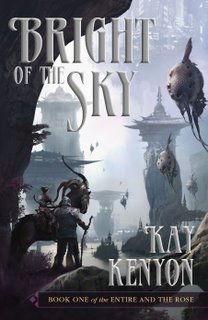
For starters, Bright of the Sky is science fiction, but it’s got a fantasy feel. Or at least a “fantastical” feel – in that it’s set largely in a pocket universe peopled with multiple strange creatures. It’s really exquisite world-building on Kay’s part, and I wanted a cover illustration that could sell the size, scope, scale of her imagination and the world that has sprung out of it. Kay and I talked over several possible illustrators before decided on Stephan Martiniere. Now, Stephan is no stranger to Pyr, and anyone who reads my blogs knows he’s one of my favorite illustrators working today, but in SF he’s known mostly – at least up to this point although it’s shifting – for his wonderful architectural visions, such as his work on Ian McDonald’s River of Gods. But in the case of Bright of the Sky, it was Stephan’s work outside publishing – particularly the wonderful outdoor landscapes and creature designs he did for the Myst computer games – that caught Kay’s attention and made her think he could communicate some of what she saw for her world. And did he ever come through, as the picture on the top-right attests.

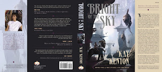
Next enter Jackie Cooke, from Pyr (and parent company Prometheus Books’) art department. At this stage, it’s about trying all sorts of options. We say we’d rather experiment and then pull back then not try to begin with. So we went through a ton of font choices, placements, and colors. Unfortunately, that was many moons ago, and I don’t have those files anymore. But suffice to say we went through a wide range – including a vaguely Asian-brush stroke type front that seemed in concept appropriate to the Chinese-like culture of one of the races in Bright, but which was too heavy handed in execution to use. Also, I don’t mind admitting that, although the end result looks nothing like it, we looked to the cover of Dan Simmon’s Ilium as one source for inspiration, particularly in the way the bronzed, embossed font of Dan’s name communicated the epic feel of the work. Finally, we settled on the design you see to the left. The font, I think, communicates both a sense of grand culture and the imposing dignity you want for an epic, “masterful” work.

So that’s the image you see in our catalog, on Amazon, on the website etc… But one of the central landscape elements of Kay’s “Universe Entire” is a mysterious river called the nigh. The nigh isn’t made of water, but a strange quicksilver substance, about which I won’t say anymore because you, well, have to read the book for yourself. But that’s the nigh you see pictured on the cover. But the colors on this cover are muted, and so Jackie and I wanted a way to both grab more eyeballs and to communicate some of that quicksilver imagery from the book. She settled on the use of a silver mirror holograhic foil, a special effect offered by our jacket printer, Phoenix Color. Ah, but when you do special effect like embossing, special dyes and inks, foil, etc… you pay per square inch. And it ain’t cheap. So, for instance, a book with the title and author name both at the top in close proximity to each other would be cheaper than a book where the effects are placed at top and bottom, like, unfortunately, we have. (If you follow the link, you’ll notice that Ilium has embossed Dan’s name at the top, but not the title at the bottom. This is why.) So, word came back that the bosses were willing to spring for the holofoil on the title, but not the title and author’s name. (Which is still mighty generous, as the effect ain’t cheap and they could just as easily have said to do without). That meant we had to find another solution for “Kay Kenyon” at the bottom. So here we have some of the colors we tried. The rainbow effect on the title is Jackie’s attempt to approximate the holographic foil, since we can’t show it in a jpg, and she wanted me to be able to see how it might pick up on and reflect various colors from Kay’s name. Here, I admit that I liked the white, but was wisely outvoted by both Jackie and Kay (we tend to involve the authors in the process – no, this isn’t the norm.) The mauve was never a consideration, though a grey that echoed the look of the catalog version was. Eventually, however, we settled on a sand color that was also used in the subtitle as the best match. I’ll wait and show it when we talk about the rest of the jacket.

Which is now. Jackie nailed the back cover in one. I love the purple on black, as well as aligning the quotes top left bottom right. I think the whole effect is very dignified and goes a long way towards our intention of presenting what an “important” epic this work is. But, as I’m sure you’ve noticed, the spine isn’t there. Sometimes, grabbing a cross section of the cover illustration can really work well. Othertimes, not so much. It just didn’t look – you know it – “epic” to me.So I suggest Jackie try a simple black spine. And maybe grab an image of that horse creature (called an Inyx) or those wonderful flying fish. I pictured placing this image at the top of the spine, but Jackie surprised me by putting it center and surrounding it in that stylish border motif she’d already devised for the subtitle:The flaps are added at this point to. Disregard the white spaces – they won’t be there on the final. So now we’re almost there, but we still need to add Kay’s picture, and Jackie felt the left flap – the grey one – was a little plain, so she decided to added a faded image from the cover to give it some texture. The result is our final dust jacket below, though, of course, you don’t see the effect of the holographic foil on the title. Right click it to see larger, as with all these, of course. And since this was a long post to put together, feel free to ooo and ahhhh.
Now tell me, does Bright of the Sky: Entire and the Rose: Book 1 look like a damn fine book or what?

Bright of the Sky: From Illustration to Finished Book Jacket Read More »

Sueños Nuevos Por Viejos

Steven H. Silver’s Reviews has posted an enthusiastic review of Mike Resnick’s short story collection, New Dreams for Old:

New Dreams for Old provides an excellent introduction to the range of Resnick’s writing and his interests. His transparent writing style allows the reader to fully enjoy the wide variety of stories, which range from personal introspective tales to galaxy-spanning adventures and morality plays. This collection, with ten Hugo-nominated stories (and two winners) and three Nebula-nominated stories is a wonderful addition to any sf collection and a reminder of the vast scope of modern science fiction.”

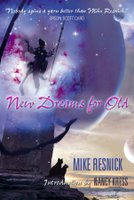
Meanwhile, just for fun, compare this cover of the Spanish language editon of New Dreams for Old, Sueños Nuevos Por Viejos, to the original cover art by Stephan Martiniere. Hmmm, something familiar about this…

Sueños Nuevos Por Viejos Read More »

Feast Your Eyes On This: Bright of the Sky

Am I allowed to have a favorite cover? If so, this could quite possibly be it. Stephan Martiniere’s latest, with design by Jacqueline Cooke. This is Bright of the Sky, the first book in Kay Kenyon’s exciting sci-fantasy quartet The Entire and the Rose. Kay, long recognized for her excellent world-building, has outdone herself with a tale of Titus Quinn, a human space pilot thrust into a pocket landscape called “the Universe Entire,” ruled by an oppressive Overlord race and peopled with multiple bizarre creatures. Bright of the Sky is high adventure & high concept, in the vein of Dan Simmons Hyperion or Philip José Farmer’s Riverworld. The world has a somewhat Mandarin flavor, and sits right between science fiction and fantasy – all of which Stephan captures brilliantly. The book is due out from Pyr in April, 2007.

Feast Your Eyes On This: Bright of the Sky Read More »

Scroll to Top