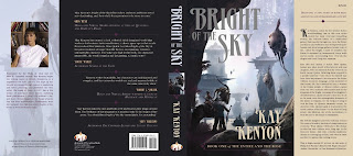
We’ve just completed the dust jacket for Kay Kenyon’s Bright of the Sky, the first book in an exciting new epic science fiction series coming from Pyr in April. Everyone is really happy with the cover, the illustration for which was already generating buzz as early as this past summer’s World Science Fiction convention. So I thought I’d use it to do something I’ve wanted to do for a while, which is to talk through the design process of putting a cover together.
For starters, Bright of the Sky is science fiction, but it’s got a fantasy feel. Or at least a “fantastical” feel – in that it’s set largely in a pocket universe peopled with multiple strange creatures. It’s really exquisite world-building on Kay’s part, and I wanted a cover illustration that could sell the size, scope, scale of her imagination and the world that has sprung out of it. Kay and I talked over several possible illustrators before decided on Stephan Martiniere. Now, Stephan is no stranger to Pyr, and anyone who reads my blogs knows he’s one of my favorite illustrators working today, but in SF he’s known mostly – at least up to this point although it’s shifting – for his wonderful architectural visions, such as his work on Ian McDonald’s River of Gods.
 But in the case of Bright of the Sky, it was Stephan’s work outside publishing – particularly the wonderful outdoor landscapes and creature designs he did for the Myst computer games – that caught Kay’s attention and made her think he could communicate some of what she saw for her world. And did he ever come through, as the picture on the top-right attests.
 Next enter Jackie Cooke, from Pyr (and parent company Prometheus Books’) art department. At this stage, it’s about trying all sorts of options. We say we’d rather experiment and then pull back then not try to begin with. So we went through a ton of font choices, placements, and colors. Unfortunately, that was many moons ago, and I don’t have those files anymore. But suffice to say we went through a wide range – including a vaguely Asian-brush stroke type front that seemed in concept appropriate to the Chinese-like culture of one of the races in Bright, but which was too heavy handed in execution to use. Also, I don’t mind admitting that, although the end result looks nothing like it, we looked to the cover of Dan Simmon’s Ilium
 as one source for inspiration, particularly in the way the bronzed, embossed font of Dan’s name communicated the epic feel of the work. Finally, we settled on the design you see to the left. The font, I think, communicates both a sense of grand culture and the imposing dignity you want for an epic, “masterful” work.
 So that’s the image you see in our catalog, on Amazon, on the website etc… But one of the central landscape elements of Kay’s “Universe Entire” is a mysterious river called the nigh. The nigh isn’t made of water, but a strange quicksilver substance, about which I won’t say anymore because you, well, have to read the book for yourself. But that’s the nigh you see pictured on the cover. But the colors on this cover are muted, and so Jackie and I wanted a way to both grab more eyeballs and to communicate some of that quicksilver imagery from the book. She settled on the use of a silver mirror holograhic foil, a special effect offered by our jacket printer, Phoenix Color.
 Ah, but when you do special effect like embossing, special dyes and inks, foil, etc… you pay per square inch. And it ain’t cheap. So, for instance, a book with the title and author name both at the top in close proximity to each other would be cheaper than a book where the effects are placed at top and bottom, like, unfortunately, we have. (If you follow the link, you’ll notice that Ilium
 has embossed Dan’s name at the top, but not
  the title at the bottom. This is why.) So, word came back that the bosses were willing to spring for the holofoil on the title, but not the title and author’s name. (Which is still mighty generous, as the effect ain’t cheap and they could just as easily have said to do without). That meant we had to find another solution for “Kay Kenyon” at the bottom. So here we have some of the colors we tried. The rainbow effect on the title is Jackie’s attempt to approximate the holographic foil, since we can’t show it in a jpg, and she wanted me to be able to see how it might pick up on and reflect various colors from Kay’s name. Here, I admit that I liked the white, but was wisely outvoted by both Jackie and Kay (we tend to involve the authors in the process – no, this isn’t the norm.) The mauve was never a consideration, though a grey that echoed the look of the catalog version was. Eventually, however, we settled on a sand color that was also used in the subtitle as the best match. I’ll wait and show it when we talk about the rest of the jacket.
Which is now. Jackie nailed the back cover in one. I love the purple on black, as well as aligning the quotes top left bottom right. I think the whole effect is very dignified and goes a long way towards our intention of presenting what an “important” epic this work is. But, as I’m sure you’ve noticed, the spine isn’t there. Sometimes, grabbing a cross section of the cover illustration can really work well. Othertimes, not so much. It just didn’t look – you know it – “epic” to me. So I suggest Jackie try a simple black spine. And maybe grab an image of that horse creature (called an Inyx) or those wonderful flying fish. I pictured placing this image at the top of the spine, but Jackie surprised me by putting it center and surrounding it in that stylish border motif she’d already devised for the subtitle:
 The flaps are added at this point to. Disregard the white spaces – they won’t be there on the final. So now we’re almost there, but we still need to add Kay’s picture, and Jackie felt the left flap – the grey one – was a little plain, so she decided to added a faded image from the cover to give it some texture. The result is our final dust jacket below, though, of course, you don’t see the effect of the holographic foil on the title. Right click it to see larger, as with all these, of course. And since this was a long post to put together, feel free to ooo and ahhhh.
 Now tell me, does Bright of the Sky: Entire and the Rose: Book 1
 look like a damn fine book or what?
 A huge congratulations to Stephan Martiniere, whose cover illustration for the third book in Kay Kenyon’s ongoing space opera quartet entitled The Entire and the Rose, the forthcoming City Without End, just won the Silver Spectrum award in the book category. All of Stephan’s covers in this series have been amazing. Book one, Bright of the Sky,
made the Spectrum annual the year it was released, and we’re hearing good things about A World Too Near
– which just hit shelves this week. (For a look at these two covers side by side, see Kay’s website.) And now, unveiled here for the first time, the winning cover of City Without End. This is my favorite of the three “Entire” pieces, and maybe one of my favorite Martiniere illustrations ever.


