Artwork

Todd Lockwood’s The Stormcaller, From Sketch to Finish

Over on Tor.com, art director Irene Gallo has just posted “Todd Lockwood’s Stormcaller, from Sketch to Finish” a very in-depth breakdown of the evolution of the cover for our forthcoming title, The Stormcaller: Book One of the Twilight Reign,by Tom Lloyd. With quotes from Yours Truly and a LOT of commentary from Lockwood himself, and 20 different sketches, roughs and detailed close-ups, the post is well worth checking out.

Todd Lockwood’s The Stormcaller, From Sketch to Finish Read More »

Tor.com Analyses Brasyl Covers

In his series on the Hugo Novel nominees, Pablo Defendini of Tor.com is taking a look at both the US and UK covers for Ian McDonald’s Brasyl.Our cover was designed by Jacqueline Cooke, illustration by Stephan Martiniere. The U.K. Edition Illustration & Design is by Dominic Harman, (another fine artist that we have engaged for our upcoming James Enge title, btw.)

Full analysis and subsequent discussion well-worth checking out, but I’m particularly gratified that Pablo got what the overlays of the title were meant to represent:

“The neon/florescent color scheme for both the painting and the type certainly communicates a sense of electric vibration, which ties in nicely with the concept of quantum computing (and certainly reminds us of Terry Gilliam’s film by the same name). Perhaps florescent or otherwise special inks were used in printing—the final effect is blindingly intense. Overlaying three instances of the title, off-register with each other and in three different neon colors adds to this vibration. It also complements the bustle depicted in the street scene nicely. Additionally, the three instances of the title relate conceptually to the three-story structure of the novel. While the choice of typefaces is somewhat orthodox, and could be perceived as boring under other circumstances, I think it works in this case: anything more complicated or ornate for the title would have rendered it much harder to read, when coupled with the three-instance treatment; and the simplicity and directness of the sans-serif typeface used for the author’s name serves as a nice contrast to the busy, hectic feel of the title proper. It also adds a solid, light-valued area to the top of the composition, which helps balance out the lightest areas of the illustration towards the bottom, and tie the composition together a little better.”

Tor.com Analyses Brasyl Covers Read More »

Behold the Man: John Picacio

John Picacio guests on Stargate: Atlantis executive producer Joseph Mallozzi’s blog. John answers questions from Mallozzi’s readers – all his comments are well worth checking out.

Meanwhile, here’s a taste: “There’s another shift that happened around the early-90’s, right around the time when Chip Kidd and the Knopf design staff was making a big splash with their Random House covers. I think an unfair stigma was placed on illustration as being an element that ‘limited’ a book to a genre audience, and publishers therefore relied more and more on stock photography and in-house designers to create covers. In the process, they lost sight of the full potential of original drawings and paintings to sell product in the marketplace. Kidd’s a smart designer, but I often wonder if he perhaps helped spread that stigma in interviews because it glorified designers like him, at the expense of illustration. The fact is, publishing still thinks this way today and I think it’s a self-fulfilling prophecy that stunts the growth of ideas, profit, and outreach. Somewhere along the way there, publishers generated this self-fulfilling prophecy that illustration limited audiences. Perhaps it’s just a nice story that helps them cut costs and save in-house jobs? The fact is, there are dozens of examples of illustrators who didn’t limit audiences, but instead transcended time and context, and expanded audience and profit. The list is long and diverse – try J.C. Leyendecker in the 1910’s, Norman Rockwell in the 1940’s, the aforementioned Powers in the 1950’s, and Dave McKean in the 1990’s, to name only a few off the top of my head. We’re talking about revolutionary cover artists of their time with huge critical and commercial impact that exploded the growth of their publications beyond the existing audience. So if it’s possible in those eras, why say that today’s mainstream audiences aren’t sophisticated enough to embrace progressive, original illustration?”

Behold the Man: John Picacio Read More »

Podcast: What Makes A Cover Work

Tor podcasts just uploaded a panel discussion from last years Boskone (I think) on “What Makes a Cover Work” (Parts One and Two) with Yours Truly, Tor art director Irene Gallo, artists John Picacio & Tom Kidd, and Tachyon publisher Jacob Weisman. This was actually a pivotal moment in my own thinking about cover art, and Jacob’s comments about “judging a portfolio by its worst work, not its best” has stayed with me ever since.

Podcast: What Makes A Cover Work Read More »

Big Cover Art Roundup

The folks at SFSignal have another brilliant Mind Meld discussion up. This one asks, “What do you feel is the primary purpose of a book cover: To accurately reflect the story or to visually ‘sell’ the book? How do you balance these two ideas when creating a cover?” Answers come from such noted artists as Bob Eggleton, Bruce Jensen, Irene Gallo, John Picacio, Boris Vallejo, Dave Seeley, Todd Lockwood, Dan Dos Santos and Glen Orbik. All the responses well worth reading, though I’m struck by this line from Picacio: “The most invigorating stuff rises to the challenge and still explores that fertile place where the signs of the times and the signals of the story converge.”

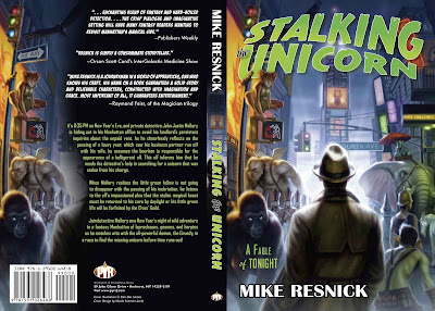
And on the subject of cover art, here’s the full jacket to the forthcoming Stalking the Vampire: A Fable of Tonight. Artwork by Dan Dos Santos, design by our own Nicole Sommer-Lecht.
What do you think?

Big Cover Art Roundup Read More »

Lou on the Web

Lots of Lou on the Web!

SFSignal is back with another Mind Meld. This one looks at Hollywood Science Fiction and asks “What other story, or stories, do you believe are deserving of being made into movies and why?” In addition to Yours Truly, responses are from Peggy Kolm, Michael L. Wentz, Michael Blackmore, SciFiChick, and the always interesting John C. Wright. Wright argues that, as a visual medium, “A science fiction movie that does not involve spectacle and special effects is not taking advantage of the primary strength of movies.” I concur. I’d pick my list from some newer works though, as nothing dates like the future. Still, as I say in my own piece, with the cost of CGI dropping, there’s going to be more of everything, so I think they’ll be enough to keep us all happy.

Meanwhile, I’m interviewed about illustrator Stephan Martiniere over on io9.com in “The Future Will Be Bio-Mechanical.” Some very nice samples of his work, including the concept art he did for the I, Robot film that happens to be the piece that lead me to put him on our edition of River of Gods.(And speaking about Ian McDonald books, although I’m not in it, there is an interview with Ian talking about both Brasyland the forthcoming The Dervish House up at Post-Weird Thoughts.)

Finally, GalleyCat uses the occasion of Michael Moorcock’s Grand Masterhood to quote me and others talking about John Picacio’s genius in a piece titled “A Grand Master’s Greatest Character Reborn.” This is, of course, about Picacio’s recent work conceiving and illustrating Moorcock’s Elric: The Stealer of Soulsreissue for Del Rey as well as our own The Metatemporal Detective.Michael Whelan’s Elric has always been the definitive portrayal of the character for me. Until now. Go see why.

Lou on the Web Read More »

Behold the Son of Man

John Picacio has turned in the final artwork for the forthcoming Pyr reissue of Robert Silverberg’s classic Son of Man.He talks about the process of creating the preliminary sketches here, with a rare glimpse at some of his pencils, and the final work done on the finished painting here. (I’m intrigued by his Jimi Hendrix comments.)

Son of Man is one of my favorite SF book of all, so I’m thrilled to be reissuing it under the Pyr banner. And Silverberg and I both knew that John was the perfect illustrator for this job. For those who know the book already, I think you’ll agree that Picacio has done an incredible job picking up on both the messianic and the sexual overtones, and has managed to get that 60s/70s psychedelic feel without feeling at all like he was going retro or pastiche. Here’s the full wrap-around painting:


Behold the Son of Man Read More »

Scroll to Top