Art by Dan Dos Santos.
Design by Nicole Sommer-Lecht.
Design by Nicole Sommer-Lecht.

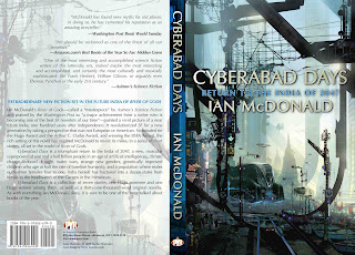
Cyberabad Daysby Ian McDonald.
Art by Stephan Martiniere.
Design by Nicole Sommer-Lecht.

Both those covers are great, while being very different. And suggestive of the books’ differences. I look forward to both of them.
(I got River of Gods for Xmas. Woo!)
(Also, did you mention in an earlier post that you’ll be introducing ebooks this year? I can’t seem to find the thread.)
I’m a big fan of Martiniere now, so I especially like the Cyberabad Days cover.
OTOH, the cover of your own novel does capture the three timeframes–although I think that Galaad might have been depicted a *little* more distinctive. I can see that Sandford is Victorian at a glance, that Alice is modern punk, but Galaad doesn’t quite register his time frame so easily.
Hey, thank you both. The books are *very* different, but oddly End of the Century has a LOT of similarities with another Ian McDonald, Brasyl, while being a totally different story. They were writing both books at the same time, independent of and in ignorance of each other’s, but I was in the middle being blown away. Something in the zeitgeist…
"Nice, yes?"
Need you ask?
I just looked at the blown-up covers. The amount of detail in Martiniere's is just amazing! I could look at it for hours and probably still miss stuff in it.
Dos Santos cover is, for me, average. It just doesn't keep me coming back to it. And I like a lot of his stuff, just not this one particularly.
On another note – went to Barnes&Noble today & relearned why I like Amazon.Com so much. I found Blood Debt with no problem, only to discover it was Book Two in the series. And did they have Book One? You guess the answer. Amazon just got some more of my discretionary income.
Fantastic.
Looking forward to End of the Century.